07/02/2017
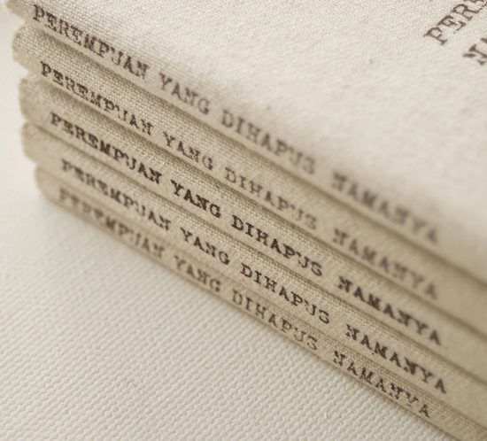
Perempuan Yang Dihapus Namanya
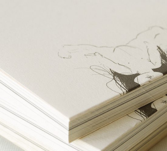
Perempuan Yang Dihapus Namanya is a compilation of poems by architect and writer Avianti Armand. Each poem in this book was inspired by women in the bible, whom the writer feel most of them were forgotten or left out from the history. Perempuan Yang Dihapus Namanya was published by apublication.