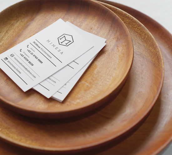
Print Archives — Feat | Jakarta Based Graphic Design Studio
155
archive,tax-portfolio_category,term-print,term-155,qode-social-login-1.0,qode-restaurant-1.0,ajax_fade,page_not_loaded,,select-child-theme-ver-1.0.0,select-theme-ver-4.4.1,wpb-js-composer js-comp-ver-7.4,vc_responsive
Mimesa business card on top of mimesa wooden plate

Mimesa

Mimesa is a handmade home-ware brand. The name is taken from Spanish words mi and mesa which literal translation means my table. We designed Mimesa’s story to be told through its logo mark; the letters M and a table icon combine together symbolize three product lines: wooden wares, marble wares, and metal wares. The visual identity system was designed to convey the look and feel of modern luxury style brands.

Asian Games 2018 KEEP THE DREAM ALIVE tagline

Asian Games 2018

Here’s our proposal for Asian Games 2018 visual identity system and mascot design. We’re humbled and grateful for the reception of the new visual identity system as well as the mascots.


KEEP THE DREAM ALIVE
Inspired by the vision and dreams of our founding father, Soekarno, during the preparation for 1962 Asian Games in Jakarta, we decided to use Gelora Bung Karno Main Stadium shape for the 2018 Asian Games identity’s mark (symbol), with eight paths leading to the stadium and the Olympic Council of Asia’s shining sun emblem in the centre.

We believe that when all these Asian nations come together for the 2018 Asian Games, there will be a showcase of The Energy of Asia that will radiates throughout the world. And also we believe it’s the right time for us as a nation to remember once again the vision of our founding father, that is why for us, ‘Keep the Dream Alive’ is a good story and resonates well for this event.


UNITY IN DIVERSITY
The Energy of Asia lies in the diversity of it’s culture, heritage, and legacy. When all these elements come together, they will be a major force to reckon in the world. The same principle applies to Indonesia, home to hundreds of ethnic groups speaking many different languages. Our Founding Fathers had envisioned a strong and united nation under the Bhinneka Tunggal Ika philosophy. That is why we decide to propose three different animals as the official game’s mascot.

Bhin Bhin, a bird of paradise, who represents strategy wears a vest with Asmat pattern details from Papua. Atung, a Bawean deer, who represents speed wears a saroong with Jakarta’s batik tumpal pattern. And Kaka, the one-horned rhino, wears Palembang’s traditional attire with flower pattern, represents power.


Side note and disclaimer:
Feat studio were one of many that entered Ministry of Youth and Sport Indonesia and BEKRAF competition to re-design the visual identity system and mascot for the 2018 Asian Games. The initial brief was to design an identity system that can both represent Asia, Indonesia and Sport as well as the theme of “Energy of Asia”.

NAVA Villa

Nava Villa is a villa block located in Canggu, Bali, designed by architect Andra Matin. Inspired by Bale Bengong, the construction make a floating illusion. For the Identity we highlighted the floating concept, by making the V rise above the rest character. This concept applied to the booklet as well. Using clear acrylic for the cover, then stamp the V on the frontside, and N, A, and A on the inside, resulting in different depth making the V looks floating from the rest.

W-Miitem-take away packaging

W-Miitem

W-Miitem is a restaurant line from Flavours of W group. The name “Mi item” actually means black noodle, which is the signature of this restaurant. We were tasked to refresh the brand looks with a brand new menu design, complete brand collaterals including take-away packaging. We used the squid ink, which is the main ingredients of what makes W-Miitem, as the main design element.

Style Studio

Style Studio is a brand new “blow dry bar” concept created around a very simple idea: No Cuts, Style Only! Style Studio is here to compliment your salon experience. They provide top-notch styling services to help you achieve the glamour you desire.

In developing the visual identity, we looked into the vast catalog of hair styling available from the earliest to the latest trends. The monogram was inspired by the common form of hair braiding – visually, with the two abstracted “S” coming together to form the shape of a simple hair braid – the result is a bold and iconic symbol that makes the brand easily recognizable in its clean and modern feeling.

Aside from the graphic languages, color also play an important role in the visual identity system. We decided on the combination of coral red and dark grey as the main identity color, which makes it highly identifiable and features in many of the design expressions.

I Love Fashion

I Love Fashion Collection is inspired by the pret-a-porter shows in Paris, Milan, London, New York & LA. A brand whose essence line in its contrasting features, showcasing unexpected juxtapositions of leather, lace, full-bodied tulle with form fitting tops. A style that set itself apart in the lines and colors of the clothes available today.

For their first launch in Indonesia, we’re tasked to design their brand necessities such as hang tag, lookbook, shopping bag and shoe packaging.

Photos and collection by STELLARISSA.

atrip brand essentials - letterhead, bag tag, itinerary, poster, stamp, business card and pins

atrip

Atrip specialize in providing architecture, art, culture, design and lifestyle tour destinations both for  professionals practitioners as well as students. Their trips provides you a chance for self-discovery in the creative world as well as an opportunity to live like a local. Unlike the usual tour & travel company that is fixated with their pre-plan timetable and schedule, Atrip provides a more flexible schedule for you to fully experience the trip.

We’re tasked to create an identity that will convey their message as well visually appealing to their majority audiences that comes from creative-background.

We created a visual identity system that introduce the concept of “wabi sabi travel”. The logotype has a humanoid icon – taken from the lowercase “i” to symbolize the “personal experience”. The color palette is muted dark red, white and grey further reflecting their modest and relaxing manner of touring. This almost monochromatic color palette sets Atrip apart from its competitors dominated by bold colors and transport-based objects.

Accupunto

Accupunto is a furniture brand founded by passionate father and son, Yos Theosabrata and Leonard Theosabrata. Their signature design inspired by acupuncture method, resulting in unique and comfortable chair. We were tasked to design the brand book and also quarterly newsletter for the store.

Feat - Elbow Room - Vodka glass on coaster

Elbow Room

Elbow Room was Jakarta’s first Gastro Pub open in the Kemang area, that target a more mature audiences then the surrounding places. The logotype was made compact to represent the crowd at Elbow Room and the icon was based on the large window the owner has installed in the establishment.