22329
wp-singular,portfolio_page-template-default,single,single-portfolio_page,postid-22329,wp-theme-stockholm,qode-social-login-1.0,qode-restaurant-1.0,stockholm-core-2.4.6,qodef-qi--touch,qi-addons-for-elementor-1.9.2,select-theme-ver-9.13,ajax_fade,page_not_loaded,smooth_scroll,qode-smooth-scroll-enabled,no_animation_on_touch,,qode_menu_,qode-mobile-logo-set,wpb-js-composer js-comp-ver-8.2,vc_responsive,elementor-default,elementor-kit-22375
W-Miitem-stationeries W-Miitem Business card W-Miitem-take away packaging W-Miitem-Menu spread one W-Miitem-Menu spread two

W-Miitem

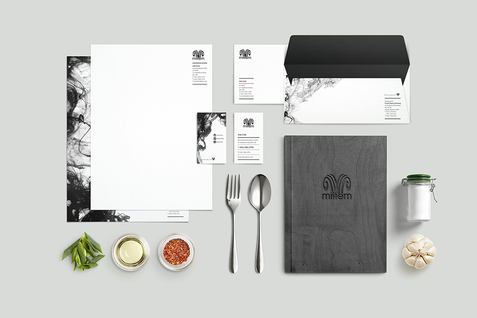
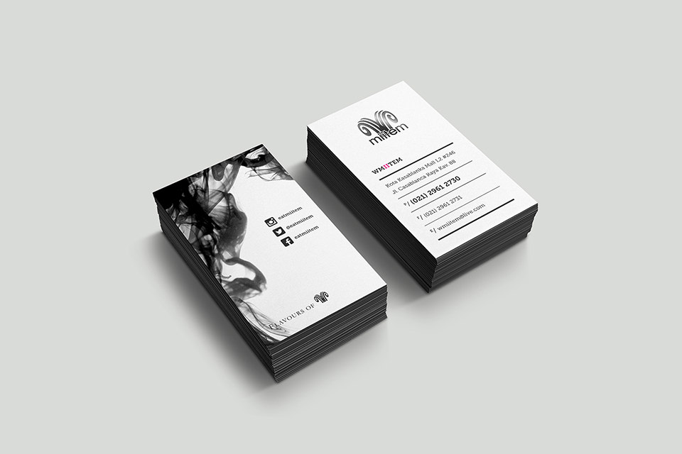
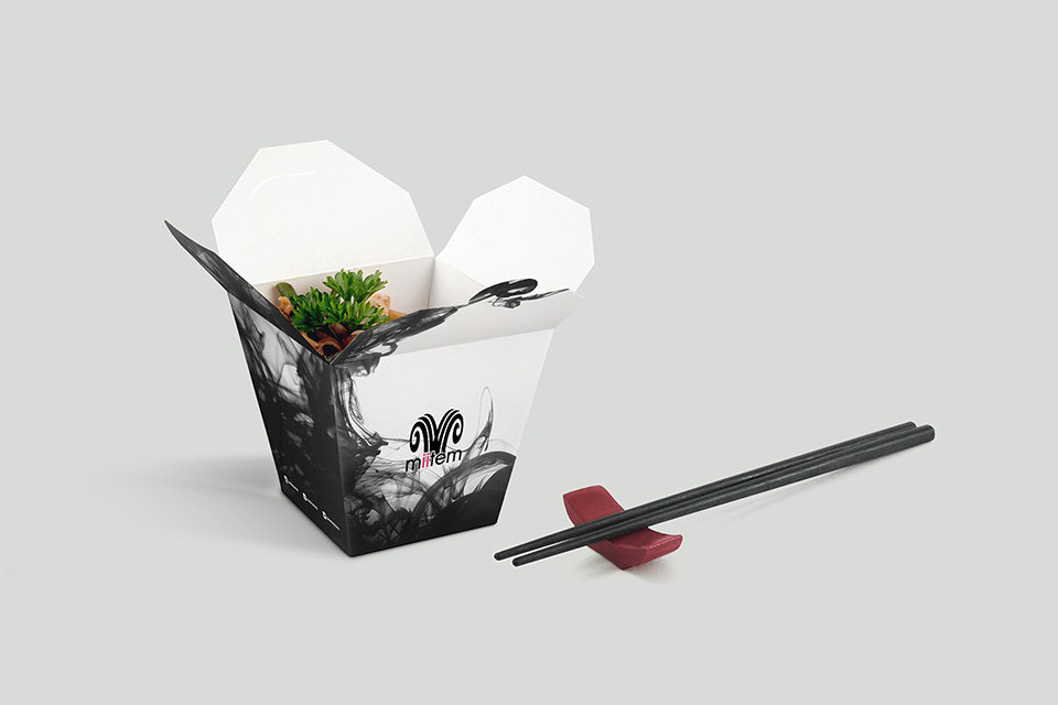
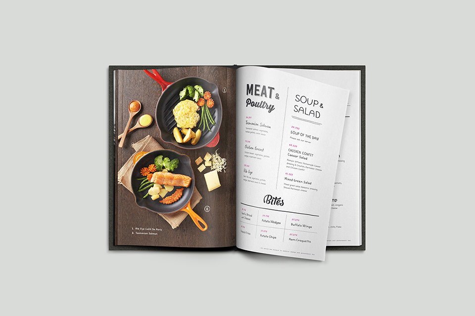
W-Miitem is a restaurant line from Flavours of W group. The name “Mi item” actually means black noodle, which is the signature of this restaurant. We were tasked to refresh the brand looks with a brand new menu design, complete brand collaterals including take-away packaging. We used the squid ink, which is the main ingredients of what makes W-Miitem, as the main design element.

Category

Art Direction, Packaging, Print

Tags

Miitem, W-miitem, William Wongso